Use FundVisualizer to compare funds across more than 80 different performance and risk metrics. Once you have selected funds for comparison, choose an interactive chart that helps tell the story that meaningful information for your clients.
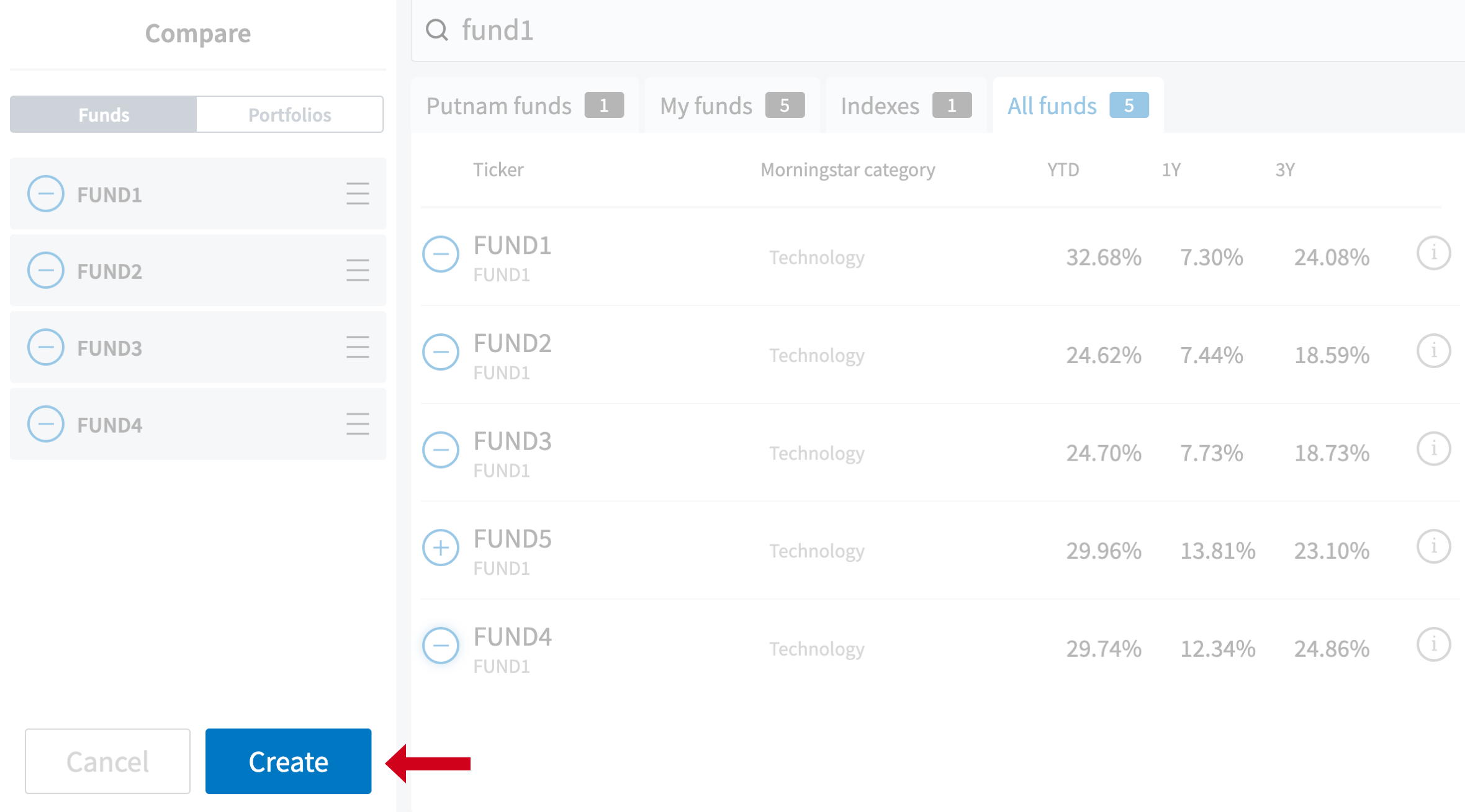
To create a comparison chart, enter the funds’ names or tickers, then click Create to see chart options.
Select an interactive chart
To view a comparison, click on one of the available interactive charts. The thumbnail images displayed contain data to show actual representations of what the chart will look like.
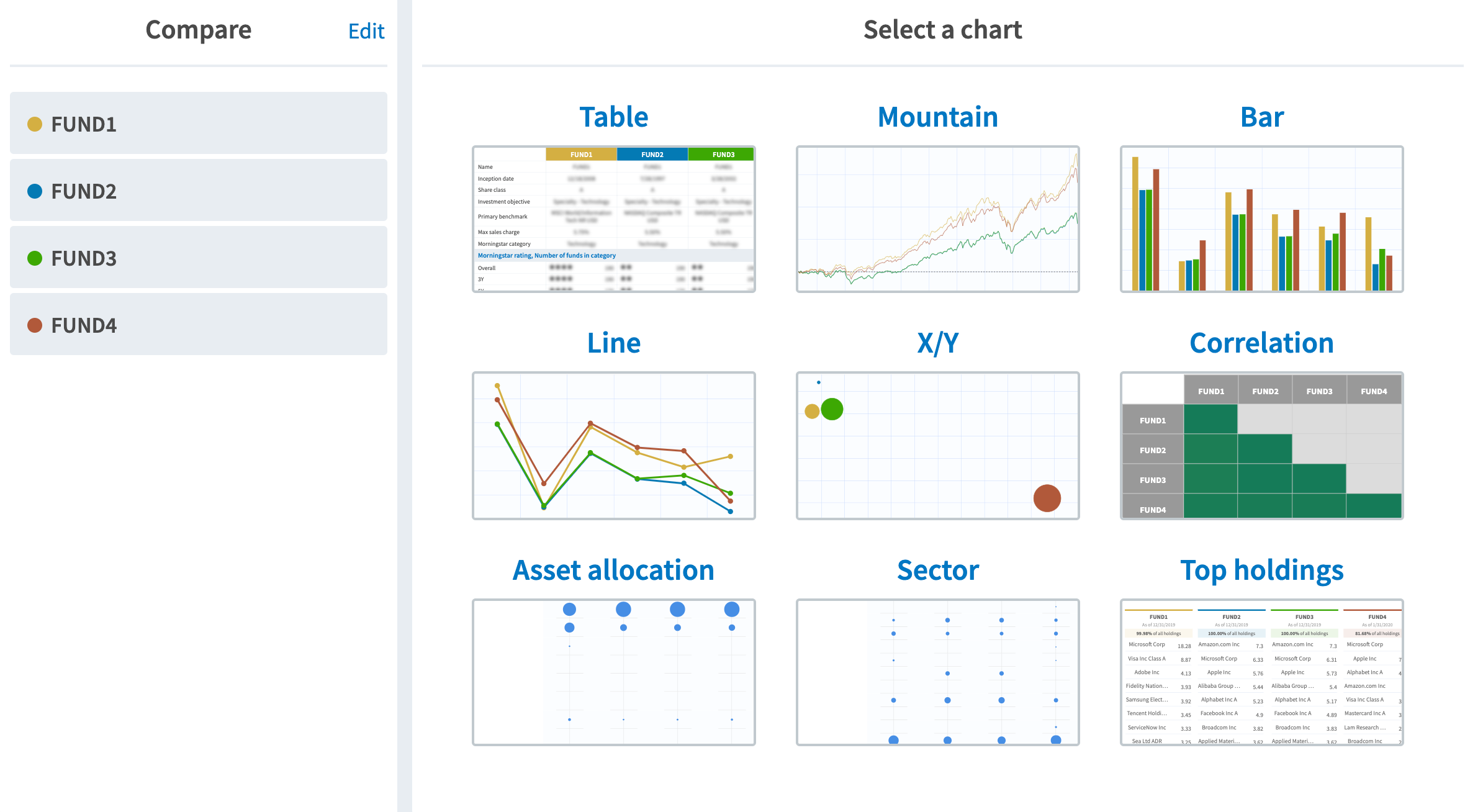
Following is an overview of FundVisualizer’s interactive charts.
Table
Fund data are displayed in a tabular format, with almost 80 performance and risk metrics. Drag and drop funds for easy side-by-side comparison.
Mountain
Overview of performance over time, defaulted to a 5-year time period. Use the sliding bar to view another rolling 5-year period, or expand or contract the time. You can also select a standard time period, or use the date range boxes to focus on a specific time frame.
Bar/Line
Performance over time in bar and line form. Drill down into details by selecting specific performance criteria to chart along the Y-axis.
X/Y
Compare funds across three-dimensions: an x and y axis, and a z, with “z” being the size of the dot. The dot size defaults to performance, but each of these axes can be customized.
Correlation
This chart shows the degree to which investments share similar risk and return characteristics.
Asset allocation
A comparison of asset allocation weighting by category, with options to view as a bubble chart or in table form. Click a point on the chart to see the percent of the fund’s balance in that specific asset allocation.
Sector
A comparison of asset allocation weighting by sector, with options to view as a bubble chart or in table form. Click a point on the chart to see the percent of the fund’s exposure to that sector.
Top holdings
Displays the top holdings in each fund. Click a specific holding to see how long the fund has held that holding and how much is invested. The chart will also highlight that holding across all funds that have the same holding.
Other functionality
Upload a list of key funds or a portfolio
Use this feature to upload a list of the mutual funds you currently recommend to your clients. On the home page, use the Import button.
Save and share comparisons
From any chart, click Save and use the default name, or create a new one. This chart and its data will be saved to your library. To share with clients, click “+PDF” to add a chart to the PDF creator.
